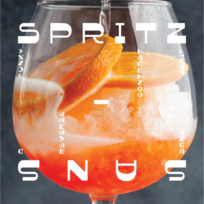
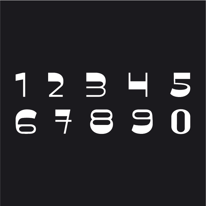
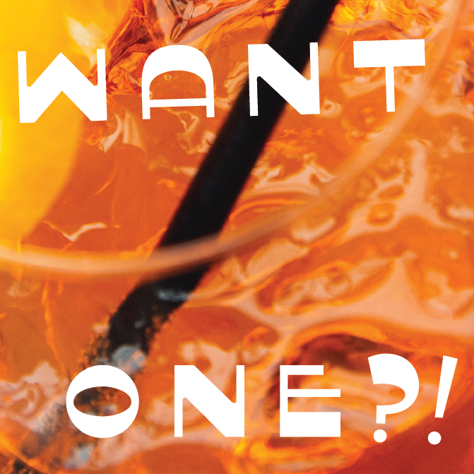
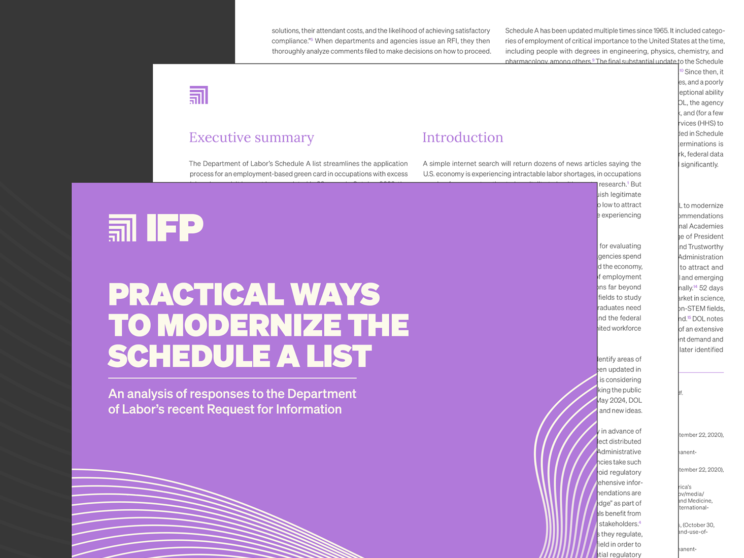
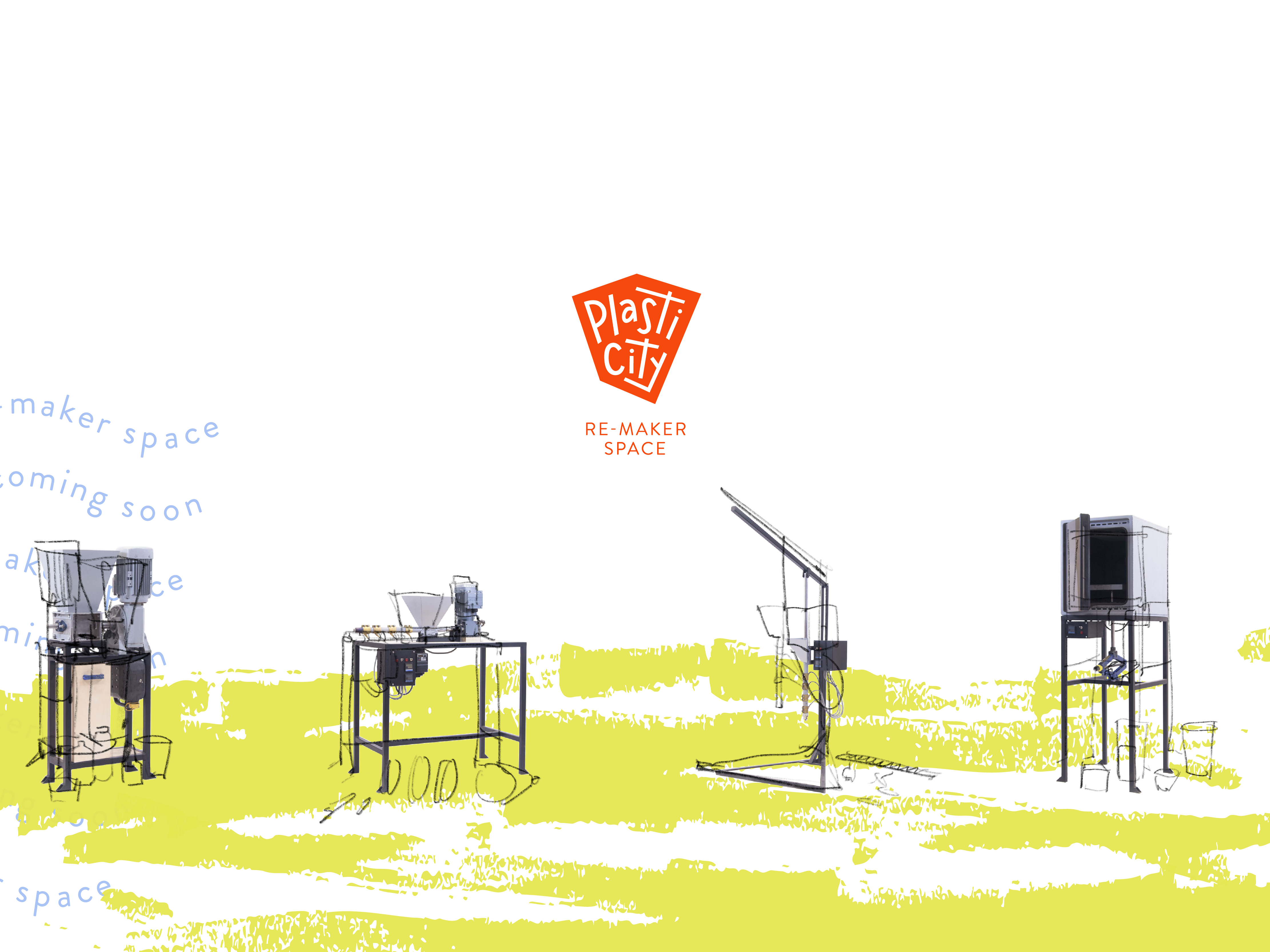
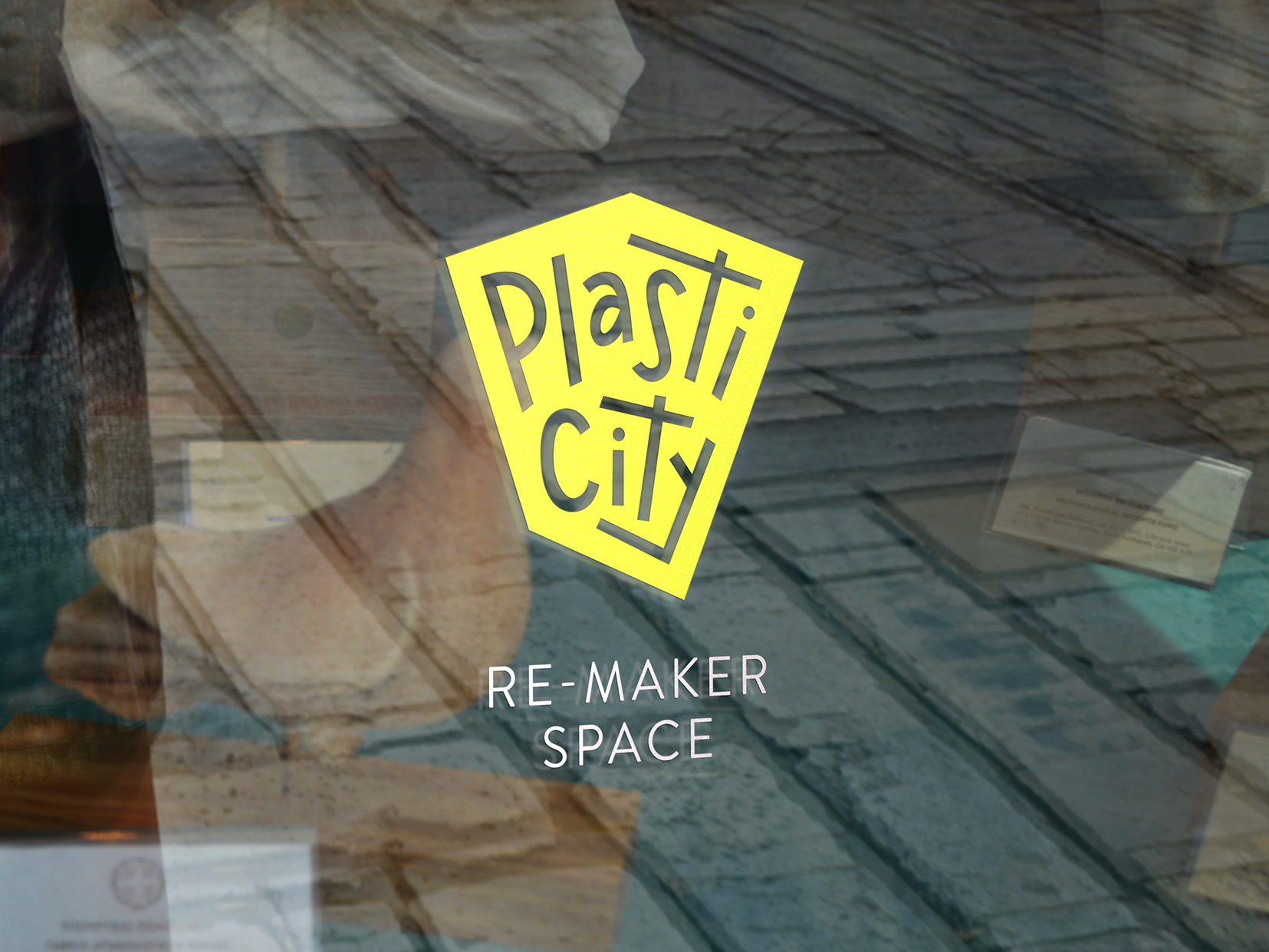
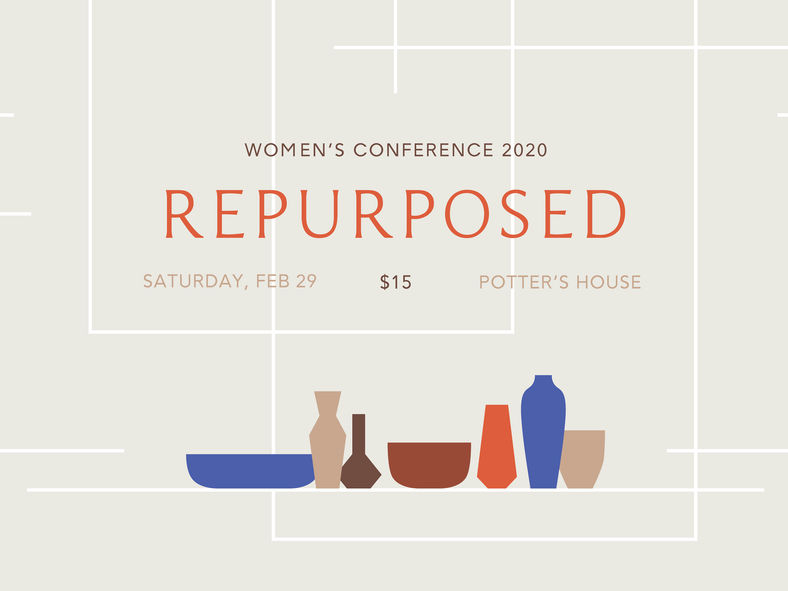
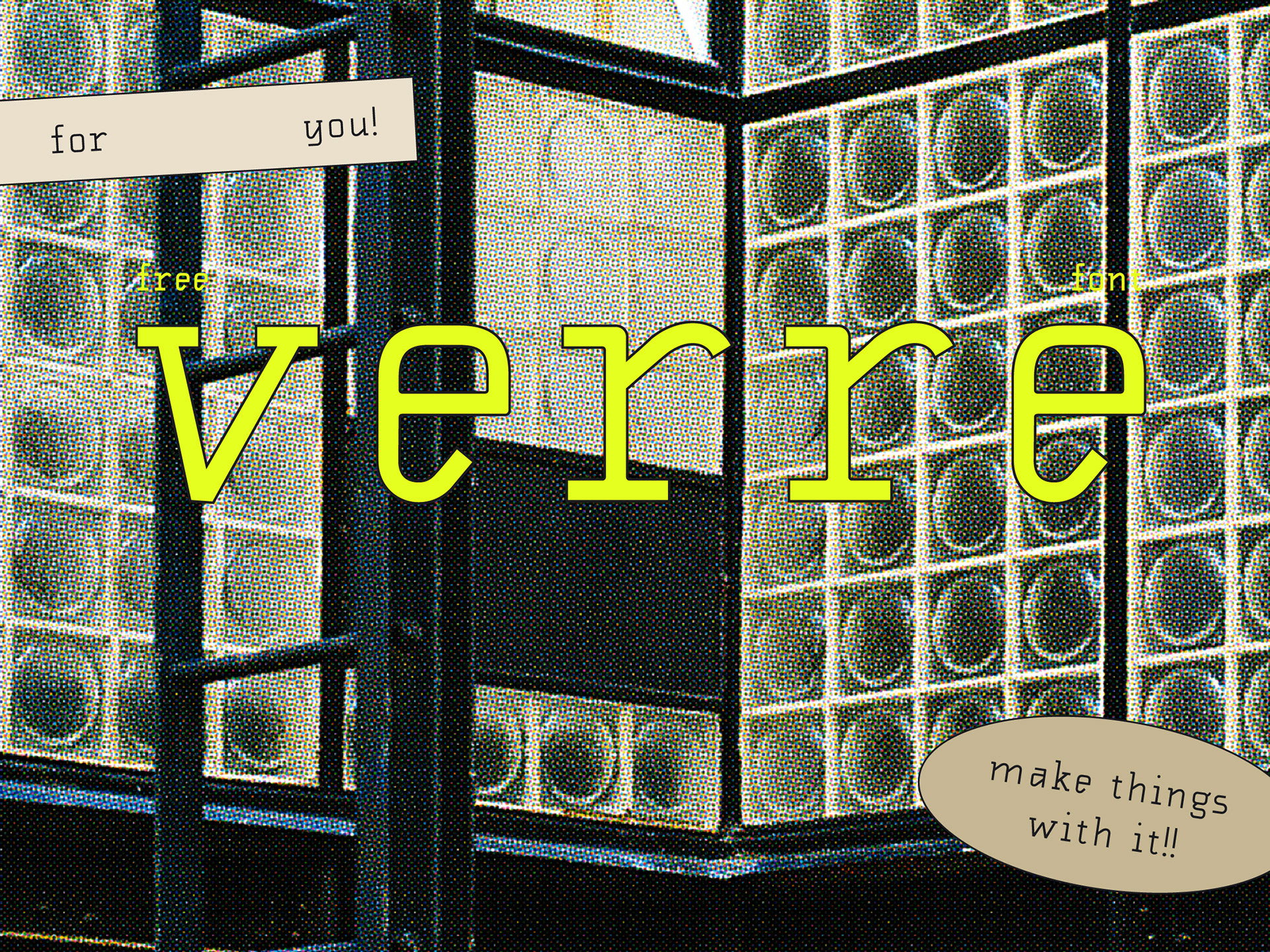
A funky reverse contrast display font.
I’m fascinated by reverse contrast as a concept and love how jarring it makes everything look. My goal was to balance the face with with the heaviest sections alternating between the top and bottom of letters.
This typeface is open and funky, experimental and clean. It’s fun and lighthearted while still being applicable to refined layouts. Its character comes from the oddball contrast– weight on the horizontal strokes rather than the verticals.
This typeface is open and funky, experimental and clean. It’s fun and lighthearted while still being applicable to refined layouts. Its character comes from the oddball contrast– weight on the horizontal strokes rather than the verticals.
Spritz is best where a high-impact yet simple display face is appropriate. It’s suitable for both print and web.
I created this typeface during lockdown as part of an online type design course– the only formal type design training I’ve had. I loved it so much and have been trying to teach myself more ever since.
