
who_
Valens Point
Valens Point
what_
Brand refresh and accompanying website.
Logo, icons, proposal slide deck, collateral.
Brand refresh and accompanying website.
Logo, icons, proposal slide deck, collateral.
about_
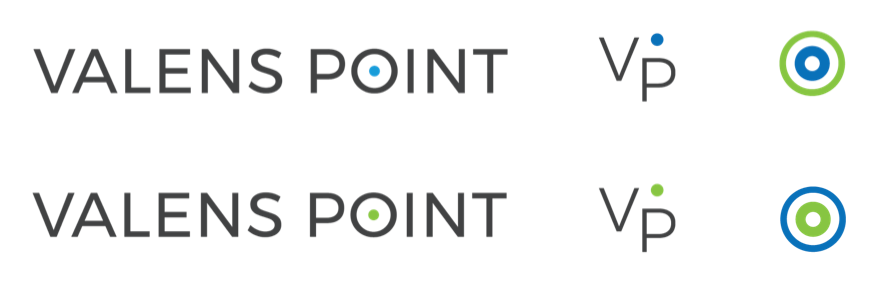
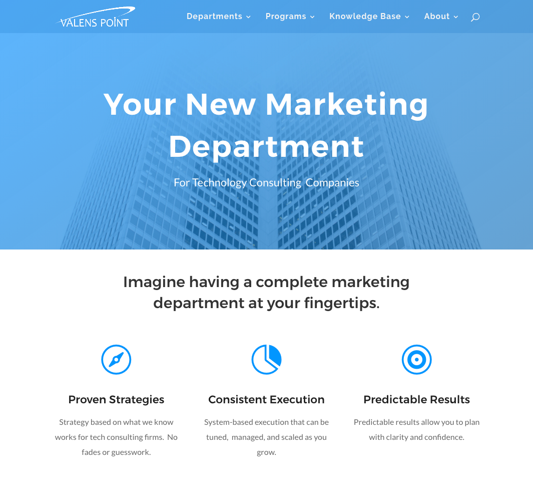
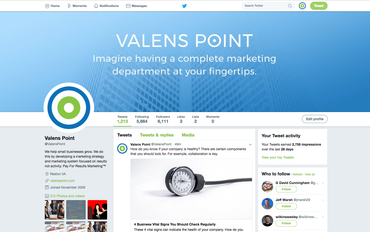
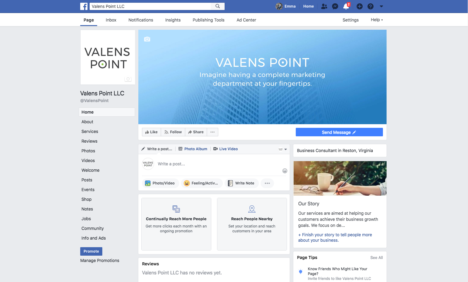
The goal with this brand refresh was to move away from a static logo and towards a brand system: interchangeable elements that function on their own and are as versatile as different media channels demand.
The goal with this brand refresh was to move away from a static logo and towards a brand system: interchangeable elements that function on their own and are as versatile as different media channels demand.
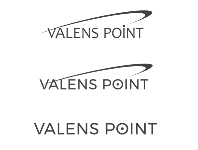
The main problem I was working to solve is illustrated here: a logo that is strictly horizontal. I began by looking at idea of the Valens ‘Point’, and ended up moving that dot above the i into the o to form a target.
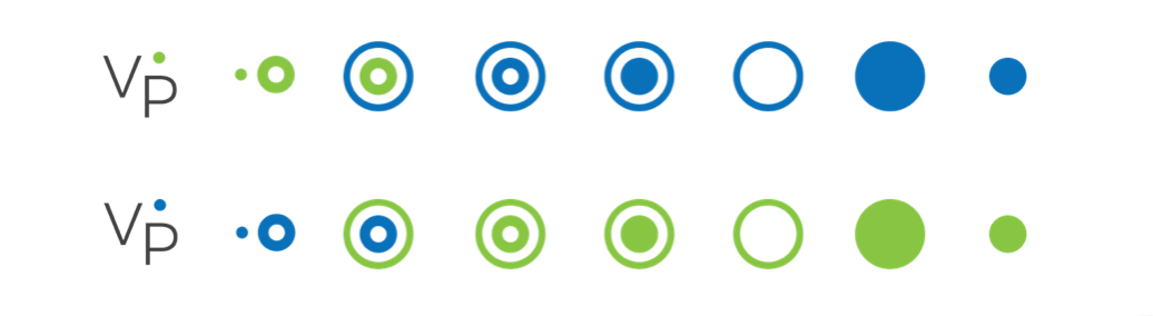
Here’s a look at how the icons break down, which should indicate how directly circles and dots informed the creation of the updated brand elements.
Here’s a look at how the icons break down, which should indicate how directly circles and dots informed the creation of the updated brand elements.